Hey, I know it's far from
perfect, but it works!
A brief origin story of this project...
📚 The Beginning...
So here's the thing – I work as a graphic designer at a big university, helping professors and experts create online courses. You know, the kind where you're supposed to make complex scientific concepts look... well, not boring. And let me tell you, there's nothing quite like trying to explain quantum physics with static diagrams. It's like trying to teach someone to dance by showing them a photo of a dance move. Not very effective, right?
As the demand for animated graphics and interactive visuals grew (because apparently, students have the attention span of a goldfish on caffeine), I found myself drowning in a sea of e-learning authoring tools. What I really needed was something simple for emphasis animation – you know, those subtle movements that draw attention to important elements, highlight key concepts, or just make things feel more alive. Timeline-based animation tools? Sure, they exist. But try explaining the Krebs cycle with a timeline. It's like trying to fit a square peg in a round hole – theoretically possible, but you'll lose your sanity in the process.
😤 The Dark Days: Hand-Coding SVG Hell
So what did I do? What any reasonable person would do – I started editing SVG code by hand. Yes, you read that right. I was manually typing out matrix transformations, bezier curves, and animation keyframes like some kind of digital masochist. All I wanted was simple emphasis animations – a little bounce here, a gentle pulse there, maybe a subtle rotation to draw the eye to important parts. But the code looked like hieroglyphics, and I was pretty sure I was developing a twitch from squinting at tiny numbers all day.
Picture this: It's 2 AM, I'm knee-deep in SVG code, trying to make a mitochondria look like it's actually doing something interesting, and I'm questioning every life choice that led me to this moment. I realized that 90% of my SVG work was just adding emphasis animations to help students focus on the right elements – but doing it by hand was absolutely maddening.
💡 The Lightbulb Moment: "There Has to Be a Better Way"
One day, after spending three hours trying to make a simple rotation animation work (spoiler: I had a typo in the transform matrix), I had an epiphany. "This is ridiculous," I thought. "I'm a designer, not a mathematician. Why am I doing matrix calculations when I should be making things look pretty?"
That's when I decided to build my own tool. Not because I'm some coding genius (spoiler alert: I'm definitely not), but because I was tired of fighting with code when I should be creating beautiful, engaging educational content. I realized that what I really needed was a simple way to add emphasis animations – those subtle movements that make educational graphics come alive and help students focus on what matters most.
🤖 The AI-Powered Development Saga
Now, here's where it gets interesting. I'm going to be completely honest with you – I used a LOT of AI to help me build this thing. Why? Because matrix math is way above my pay grade. I can make a logo look amazing, but ask me to calculate the inverse of a 3x3 matrix and I'll probably cry.
So I did what any self-respecting designer would do – I asked AI to do the heavy lifting while I focused on making it look good and actually usable. The result? A tool that works (most of the time) and doesn't require a PhD in mathematics to use.
This project became my personal experiment in learning and adapting to these new AI tools. I was genuinely curious about how quickly I could build a decent, working prototype – something I could actually use and share with my friends and colleagues. While I plan to continue pushing updates, I also know that in a few months or years, I'll want to come back and completely rewrite this with a clean, event-driven architecture. For now, though, it's serving its purpose beautifully.
🚀 From MVP to AI-Bootstrapped UI: The Real Story
Here's something I haven't mentioned yet – I actually had a working MVP long before this current version. It was... well, let's just say it was functional but definitely not pretty. Think basic HTML forms, unstyled buttons, and an interface that looked like it was designed by a developer who had never heard of CSS (spoiler: that developer was me).
The logic was there – all the core functionality worked perfectly. You could upload SVGs, add animations, export them, and everything functioned as intended. But showing it to colleagues and friends? That was a different story. The interface was so basic and ugly that I was embarrassed to demonstrate it. It did the job, but it definitely didn't inspire confidence.
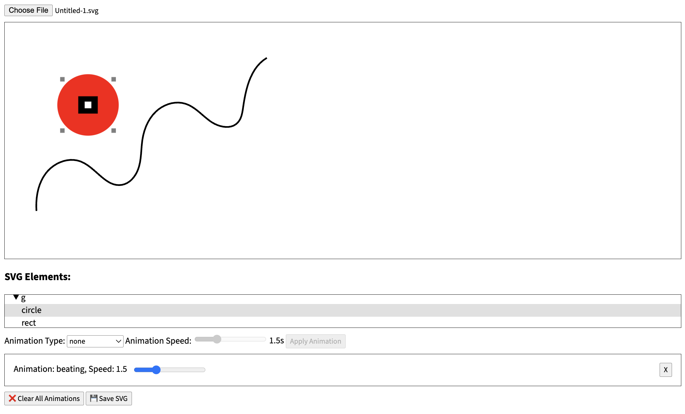
The original MVP interface - functional but definitely not pretty! 😅
So I shelved the project for a while. The MVP worked, but I knew it needed a proper UI to be taken seriously. Fast forward to discovering Cursor and ChatGPT, and I had this crazy idea: "What if AI could help me bootstrap a decent-looking interface quickly?" I was curious to see if I could transform my functional-but-ugly tool into something I'd actually be proud to show people.
I have to say, I was genuinely surprised by how fast Cursor was able to generate functional UI code. We're talking responsive design, dark/light theme support, proper styling, and everything working together cohesively. It wasn't just throwing random CSS at the wall – it was creating a complete, functional interface that actually looked professional.
Now, I'll be honest – there's definitely some repetition and dead code in there that I'll need to clean up eventually. But here's the thing: it works! And it works well enough that I can actually show it to people without cringing. That's a win in my book.
I was also curious to see what I could build without reaching for heavy frameworks. Don't get me wrong – I love Vue and Nuxt, and they're my go-to tools for most projects. But I was feeling a bit tired of the complexity, and since I'm not dealing with authentication or user data collection, I wanted to keep things as simple as possible. Just pure HTML, CSS, and JavaScript to see what would happen.
So far, I'm pretty happy with how things are turning out. The tool is functional, looks decent, and doesn't require a massive build process or complex state management. Sometimes the simplest approach really is the best approach.
👥 The Mission: Helping My Fellow Designers
As I started using the tool myself, my colleagues began asking questions. "How did you make that animation so smooth?" "Can you teach me how to do that?" "Wait, you're not manually coding SVGs anymore?"
That's when I realized this wasn't just about making my own life easier – it was about helping other designers and educators who were struggling with the same problems. People who have brilliant ideas but don't have the technical background to bring them to life. They all wanted the same thing: simple, effective emphasis animations that would make their educational content more engaging and help students focus on the important parts.
🛠️ The Tool Collection: Sharing the Knowledge
Along the way, I discovered a treasure trove of amazing SVG tools and resources online. Tools that saved me hours of work, apps that made complex tasks simple, and resources that I wish I had known about years ago.
So I decided to document and share all these discoveries. Because if I had to learn the hard way, maybe I can help others skip the "spending three hours on a typo" phase of their journey.
💼 The Portfolio Angle: Showcasing What's Possible
Here's something I didn't expect when I started this project – it became a pretty cool way to showcase what I can build on the web. As a graphic designer who's been dabbling in web development, this tool demonstrates that I can actually create something functional, not just pretty pictures. It's a perfect example of how emphasis animations can transform static educational content into something dynamic and engaging.
I'm always on the lookout for interesting work opportunities and fun collaborations. Whether it's helping other educational institutions create better online content with emphasis animations, working with developers on creative projects, or just connecting with people who share the same passion for making learning more engaging – I'm here for it.
So if you're reading this and thinking "hey, this person might be useful for my project" or "I'd love to collaborate on something like this," don't hesitate to reach out. I promise I'm much more fun to work with than my 2 AM SVG coding sessions might suggest.
🎯 The Reality Check: It's Not Perfect (And That's Okay)
Let me be crystal clear here – this tool is not perfect. It's not the "ultimate solution" or the "industry standard" or whatever fancy marketing term you want to use. It's a tool that works, built by someone who was tired of doing things the hard way.
There are probably bugs I haven't found yet. There are definitely features I haven't thought of. And yes, I'm still learning as I go. But you know what? It works. It helps me create better educational content with simple emphasis animations. It saves me time. And if it can do the same for you, then mission accomplished.
🚀 The Future: Always Evolving
This tool is constantly evolving, just like the needs of educators and designers. Every time I discover a new technique or find a better way to do something, I try to incorporate it. Every time a colleague asks for a feature, I consider adding it. Every time I make a mistake (and trust me, there are many), I learn from it.
The goal isn't to create the perfect tool – it's to create a tool that actually helps people create better educational content with emphasis animations. And if that means it's a bit quirky, a bit imperfect, and definitely not corporate-perfect, well... that's just fine with me.
🤝 Let's Connect!
If you're interested in collaborating, have a project that could benefit from some creative web development, or just want to chat about making educational content more engaging with emphasis animations, I'd love to hear from you!
Looking for:
- 🎨 Creative web development projects
- 📚 Educational content creation with emphasis animations
- 🤝 Fun collaborations and partnerships
- 💡 Interesting work opportunities
Feel free to reach out through the contact links in the footer, or if you're feeling generous, you can even buy me a coffee and we can chat about your project over a virtual cup!
💝 The Thank You
If you've made it this far, thank you for reading my rambling origin story. If you're using this tool and it's helping you create better content, that's amazing. If you find bugs or have suggestions, please let me know – I'm always learning.
And if you're still manually coding SVGs at 2 AM, please stop. Your sanity (and your eyes) will thank you.